Before and after
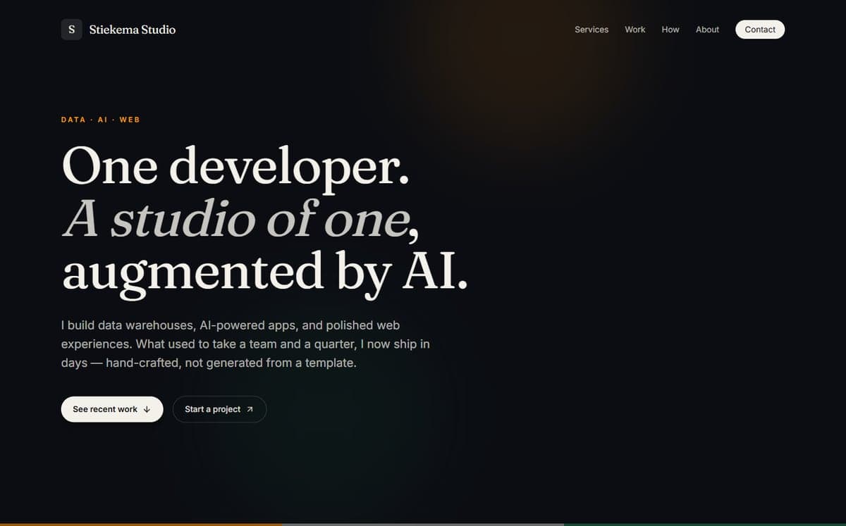
Before
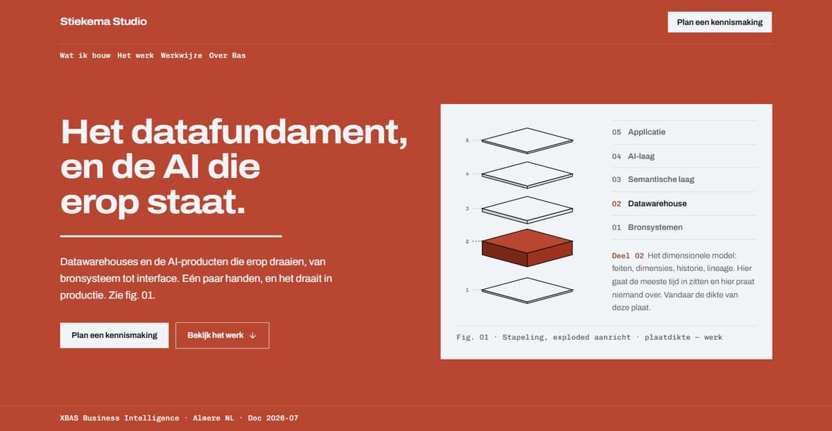
After
What the audit produced
Anti-patterns on the homepage
Measured with the deterministic detector against the production build. The remaining hit is the hatching of a project plate that is still missing.
Before: 18
After: 1
Accent colour as text (WCAG contrast)
The old amber on cream failed WCAG AA, in fourteen places. The red lead oxide clears the 4.5:1 threshold with room to spare.
Before: 2.8:1
After: 6.48:1
Review score (impeccable-critique)
The first audit gave 21 out of 40, with one P0 and four P1s. The trend baseline is set; a next run compares against it.
Before: 21 / 40
After: to be measured again
What changed
From editorial to manual
The old site leaned on a warm cream background with a serif face: precisely the aesthetic a design audit marks as the AI default. The new language is a service manual: steel stock, red lead oxide as the accent colour, tables instead of cards.
Every section heading was a label
Above every section sat a small, widely letterspaced label (DATA · AI · WEB, WHAT I DO, ABOUT). One such kicker is voice; on every section it is grammar. They are gone; the sections carry their own heading.
The scheduler was nowhere to be found
The booking scheduler was already running, but it lived on a sub-page only. The homepage ended in a mailto. Now the whole site leads to that one half hour, with the calendar inline.
No images, no evidence
The old site showed not one screenshot of the work and no photograph. For a site that claims craftsmanship that is the weakest spot. There is real work on it now, a portrait as a printing plate, and a figure that draws out the data foundation.